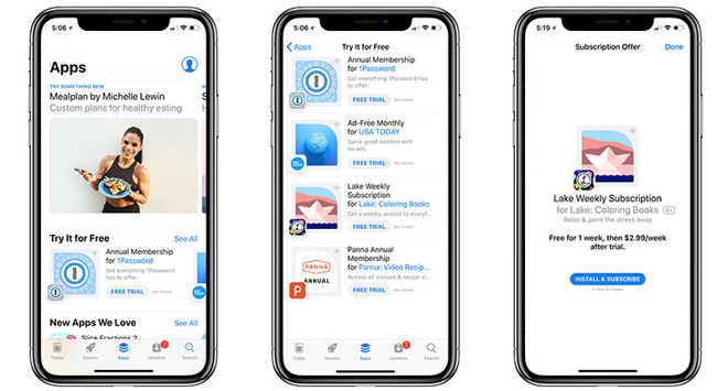
APP STORE
When I first started designing the app, I started thinking about the logo first so I went on the app store and checked how all logos were made so I can get inspired.
Source: https://www.theverge.com/2017/10/9/16446572/apple-itunes-12-6-3-app-support
/cdn.vox-cdn.com/uploads/chorus_image/image/57064313/Screen_Shot_2015-09-07_at_9.11.34_AM.0.0.png)
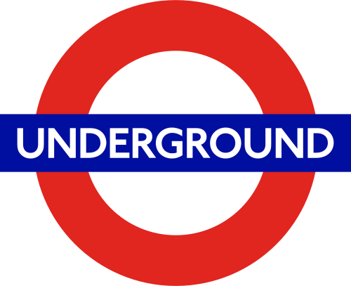
LONDON UNDERGROUND
Since my app was mostly based on the famous london underground and since logos are usually made to be memorable and catchy, I decided to recreate the Underground logo making it more about my idea and I was inspired by this image to do so.
Source: https://commons.wikimedia.org/wiki/File:Underground.svg
APP DESIGN
I did some more research on App design from the inside and got inspired by these:
Source: https://www.mockplus.com/blog/post/flat-mobile-ui-design
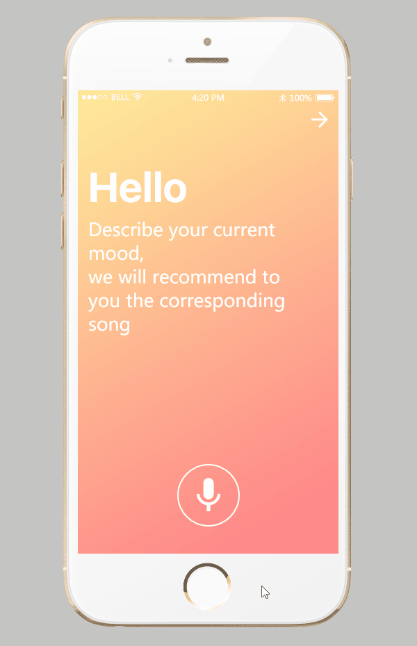
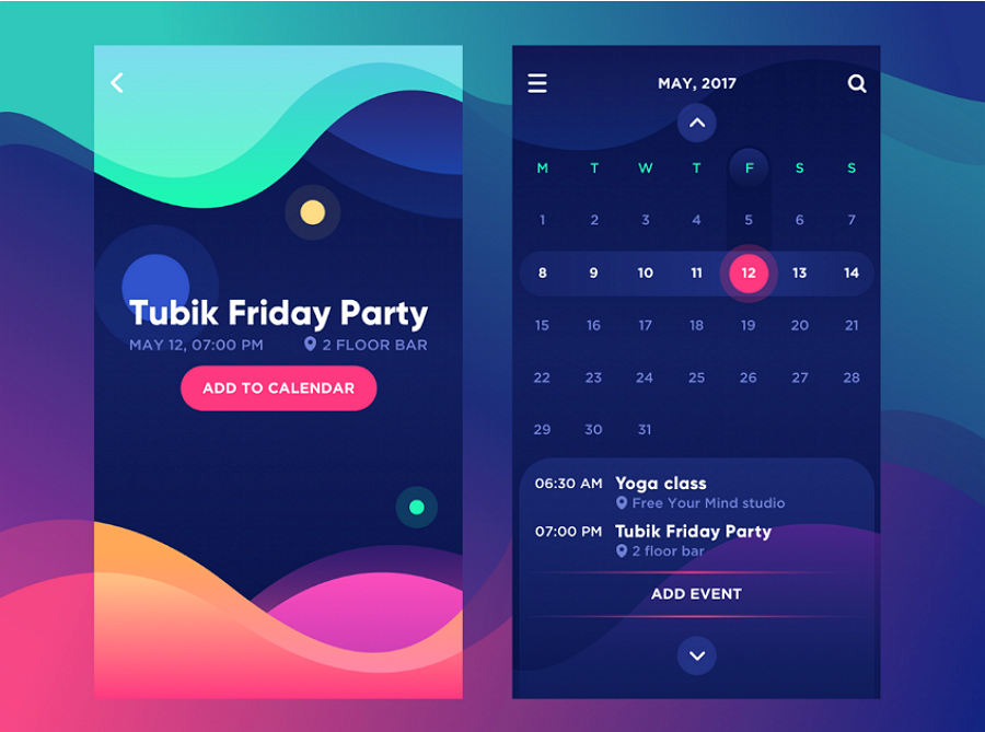
COLOR GRADIANTS
In last few years, rising numbers of designers adopt color gradients in their design works when they are trying to design logos, buttons and backgrounds for mobile app interfaces. Why? The answer is simple. Even when you have chosen a single color, you can also show a rich sense of hierarchy and draw a beautiful picture while combing it with color gradients and different graphics.
APP STORE LOGO
I also specially looked into the App Store logo and I realized that all logos symbolized the function of the app so I worked on making mine symbolize the function of the app I was creating.
Source: https://wccftech.com/app-store-and-itunes-experiencing-search-issues/
![]()
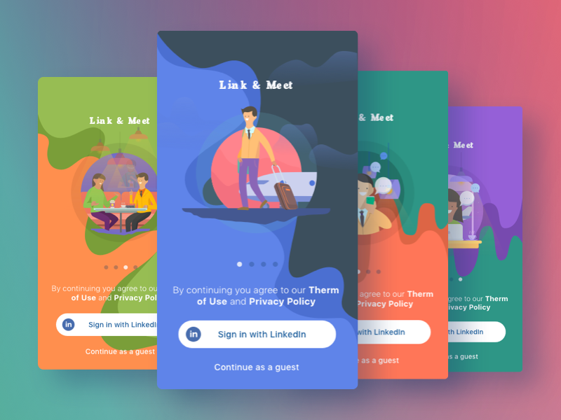
CATCHPHRASE
I knew It was essential to add a catchphrase.
It added a touch of playfulness to the idea.
So I thought "what rhymes with hygiene?"
I did some research and found that the word "Scream" rhymes with "Hygiene".
Later on, I found a song that had lyrics that were very persuasive and took them and modified them to make my own app catchphrase.
Source: https://lyricsplayground.com/alpha/songs/i/icecream.html

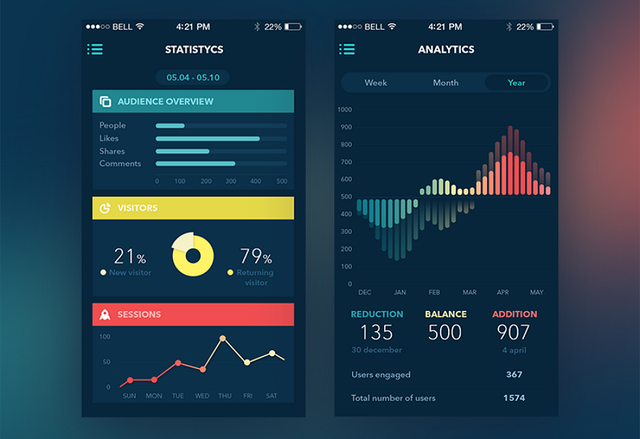
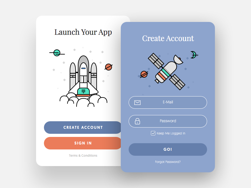
UI DESIGN
I learned about something called "UI design" which stands for User Interface Design which is the design of an app that interfaces with a screen.
Source: http://ui.theultralinx.com/post/163713080172/app-tutorial-screen-illustrations-submitted-by
CUSTOM ILLUSTRATION INTERFACE
Custom illustration also plays an important role in mobile app UI design. The mobile application interfaces with different styles of illustrations, like hand-drawing, simple style, paper-cut style and famous painting style illustrations, can not only make applications more interesting and distinctive, but also give mobile apps personalities and make them more impressive for app users.

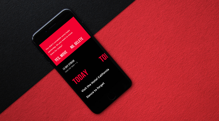
STRONG COLORS AND FONT CONTRAST
Strong color or font contrast could also help designers work out an excellent UI design to attract user attention.
APP LAYOUT
After designing the logo, I started looking into the app layout and how an app should be designed from the inside.
HYGIENE
I wanted to include in my logo some features of hygiene since that was what my idea was partly about.
I did some research and I was inspired by some logos that I found on a website.
![]()
![]()
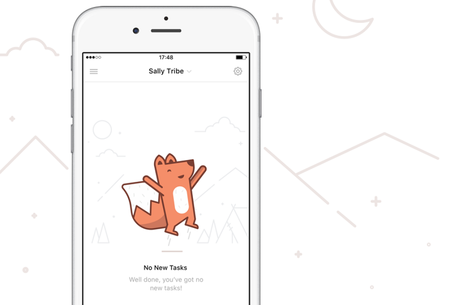
ILLUSTRATONS
The reason why I added all these illustrations to my app design is because I noticed they can add a crucial playfulness to its design and I was inspired by this article:
Source: https://uxplanet.org/10-latest-mobile-app-interface-designs-for-your-inspiration-405a98c10831


STRONG BOLD
Smart designs are not only subtle but also very easy to interact for the user. This clear and simplistic design matches the essential design concepts of Apple.

