THE 12 HOURS CHALLENGE
Last night, we had to work overnight for twelve intensive hours to propose a new future in groups. As graphic designers, we had to get into groups of 3, and create a flag of an imagined state that was based on three words. Ours was based on the words "Family, Rest and Entertainment" because we noticed, after getting to know each other through a series of questions, that we all consider family, rest and entertainment as essential things in life.
To be honest, I was actually looking forward to this challenge, because I am a person that mostly works at night, and focuses more during the night so it really was not unfamiliar to me.
What I liked the most about this project was the way we approached graphic design, It was a very different and new way to approach it and it made me realize that graphic design doesn't have to be practiced the traditional way but can be perceived in any aspect that we want to.
we learned how to sew using our hands but also a sewing machine, it was a very exciting challenge but when we first started sewing I was thinking "Am I in the wrong classroom? is this fashion?" but as we continued the project throughout the night I realized the necessity of experiencing new ways to practice graphic design.
I actually considered it a very successful project whereas it was not just like a regular college day. We did things differently, we got closer to each other as students and closer to the teachers. I think being exhausted and having to deal with it all together, makes us get closer and get to know each other more.
In conclusion, I considered this project as a successful one and would definitely do it again.
DAY 1 - IMAGINED STATES
After generating ideas and visual language during the all night workshop, we already had an idea and a sense of our imagined states.
What we had to do for today was to observe and analyse our passports as a part of primary research for this week's project.
We started off the morning by discussing our research on passports and what we discovered about these legal documents is that they're all designed depending on the country's culture, history and symbols which I found quite interesting but also very logical because the passport is a sort of identification symbolizing a person and its country.
This primary research lead us to creating our own passports which also was a process on its own because we had to take in consideration all the discussed features of a passport and whether or not we wanted to include them and how.
The way I decided to create my passport for the state I called "FUNFAM" was to make the passport a sort of movie/theatre ticket like those "Admit One" tickets because after the primary research we worked on, I realized the passport should reflect the country and what better way to reflect on a state based on fun and amusement?
My idea generated from this concept and I chose to make it all colorful adding the logo I designed for the nation which was a "tired face" indicating the people of "FUNFAM" should have enough rest.
The day proceeded with group/individual tutorials that allowed us to share our ideas and get feedback.
DAY 2 - IMAGINED STATES
Day 2 was about finalizing the passports designs and starting to go further with the project by creating cultural artifacts of our choice for our imagined state.
We spent the day sketching and I think it really creates a motivating environment when we work in class individually whereas we are encouraged by all others working, to also work on our project.
We had the chance to choose between a wide list of cultural artifacts and after sketching and thinking through sketching I chose to create: A manifesto of "FUNFAM" 'S Rules, a magazine cover of the nations own newspaper and 3 dollar notes.
We also had the chance to discuss our ideas again with the tutor which really helps you to get going and to find yourself in your work when you're feeling lost.
DAY 3 - IMAGINED STATES
Day 3, last day of the imagined states project. We got the opportunity to finalize our work in the morning session and then we displayed them all over the tables and took a look for around 30 minutes at all the projects that were done in class.
I was amazed by the creativity and commitment that some of my classmates revealed in their projects and I genuinely feel that some work that I identify motivates me to work harder every time on the next project.
The afternoon session consisted of briefing next week's project.
DAY 1- BUILDING BLOCKS
Day 1 of building blocks was exciting for several reasons:
It was our first time working with typography which was what a lot of were interested in since we entered graphic design pathway
And, because we got to test and experiment building typefaces using insulation tape.
We first started with a small introduction and primary research about modular alphabet and type faces, then we started experimenting some letters using different shapes like squares, rectangles, diamonds...
This was interesting because it made me realize the million ways of creating alphabet using shapes and forms.
Then, we were asked to create a typeface using the shape of our choice and I chose triangles because they are fun to work with and can playfully be rotated in order to create my desired typeface.
The start of this project was good whereas it was not approached to us in a hard or stressful way but rather a fun and playful way which motivated us to continue with it.
I find some projects being approached in a hard and stressful way per example "You have this and this to do in a week, only some of you will be selected...."
But, this project was a really successful one to start 2019 with.
SOMERSET HOUSE EXHIBITION
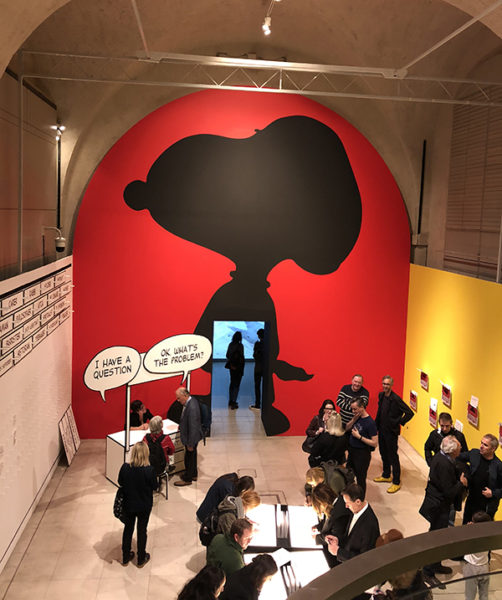
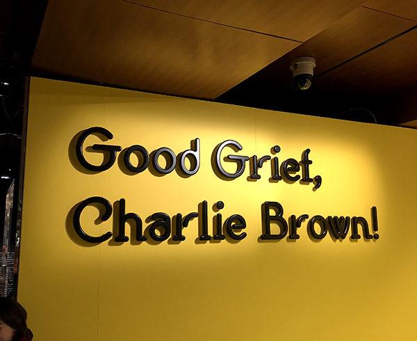
Today we went to the "Good Grief, Charlie brown!" exhibition in Somerset house to discover what our next project was all about.
Personally before coming to this exhibition I only had a very brief knowledge of peanuts and did not know all the information I discovered today.
We had a tour of the whole exhibition with the help of a guide which cleared some information about Peanuts and it's writer to us.
I found the whole exhibition very playful and funny whereas I enjoyed reading every strip on its own and took the time to get to know each character by itself.
DAY 1- CHARLIE BROWN
IN DESIGN WORKSHOP
Today was my first time working with in design and it was very nice and interesting to discover all these tools and things you can do within this program.
This workshop gave us a very clear view of how we had to create the publication and what tools to use.
DAY 1- MADE TO PERSUADE
Thursday's briefing about the "Made to Persuade" project was a bit confusing at first: I found it to be really broad which confused me specially because we were told we had to design a product which got me thinking "Why are we designing products?" "We're not even product designers!"
We started the project with questions to help us think like "What makes you angry the most?" and "what would you change in your daily routine if you could?" followed by a small group project that consisted of sharing our answers, discussing them, and designing an outcome from them. When discussing with my group, we realized the thing that frustrates us the most is the lack of sleep we experience because of CSM and that got us thinking and we ended up creating a CSM sleeping mask with a slogan that says "CSM: Can't Sleep Moderately". This very short project helped clear things up and made the graphic design part of the project clear to me.
On Monday, when we started generating ideas from the questions, I found that what I wanted to work on was women's rights and women abuse but after discussing it with my tutors, I realized it might be too much of a sensitive subject for the crowd I was addressing.
I moved on to further research taking my idea to a more general issue, that people might relate more to.
DAY 2 - MADE TO PERSUADE
After having struggled yesterday with generating ideas that involved an interaction, I chose to take my thinking further and to think about subjects that would be appropriate to the public that was going to see my work which included all parents and children coming to the open day on Saturday.
I took my Idea to a more general aspect so instead of thinking about women abuse I started thinking thinking about women's education which got me thinking about education in general. I realized that a lot of people don't have the opportunity to get a well known and well given education whether it is a high school education or a higher education one.
I decided to make me project about education and my aim was to spread the advantages of education to people and give them a free diploma that Included all advantages of education and I proceeded to design it.
DAY 3 - MADE TO PERSUADE
I developed and refined the idea that I thought about on Tuesday which was the diploma that included all advantages of education and its aim was to encourage people for education.
I was working all day trying to find the perfect outcome for it.
At the end of the day, I tested it on my classmates which pretended to be buyers and some of them advised me to add more interaction to my project which led me to design a sticker that had a person graduation on it which I would also give out with the diploma.
After testing my project, I went home to work on the sticker and it made me realize how essential it is to test your product before displaying it to the public because it helps you recognize the good and the bad things in the project so you can adjust them.
MADE TO PERSUADE - OPEN DAY
The open day was a lot of fun.
It was really exciting to exhibit our projects to these people thinking about sending their kids here and the kids themselves.
I got the opportunity to chat with some people that asked about the experience, the pressure, the projects and I also got a chance to discuss my work and interact with the public about education and its advantages specially being a student in CSM.
I think we did a good job showing them what it really is like to be a foundation student at Central Saint Martins.
DAY 2- BUILDING BLOCKS
On day 2 of building blocks, we moved on to a new exercise that did not Include producing modular typefaces nor using insulation tape but rather ten recognizable objects to work with.
The aim of this second part of "Building Blocks" was to create an object alphabet.
We had to draw and sketch these ten objects on our sketchbooks then identify the three who had the most potential on being turned into a typeface.
Then, choose one that seems to work best.
The challenge of this part of the project was that we were not allowed to add or remove anything from the object but rather identify the letters within it.
I chose to make my alphabet out of a pencil sharpener because I found potential in it and identified several letters within it.
The object alphabet introduced us to another way of creating a typeface other than the modular way.
DAY 2- CHARLIE BROWN
Day 2 of this project was based on planning the publication and most importantly choosing the right character that we wanted to make the publication about.
After carefully looking through the exhibition and with the help of further research, I got to know all the characters.
Lucy is the character I chose to make my publication about.
She is the one that I related most to during the exhibition and while reading the strips.
She reminded me of some aspects of myself.
She seemed like a character that had a somehow mean approach to people and that was always harsh about the truth and I wanted to develop that.
I chose to make a publication, that included mostly writing and that showed the two perspectives of each story making it clear that sometimes people don't mean to be mean and that there are two sides for every story.
I enjoyed doing the publication but as a project it was certainly not my favorite whereas I did not like the fact that we had to create a publication out of a specific thing that seemed so wide as well.
DAY 1 - APP STORE
After reading the brief, researching and analyzing the three most used apps on our phones, we were introduced to this project on Monday morning.
We got paired up with a random person from class and got to spend the whole morning/lunch time together, getting to know each other and keeping notes.
The aim of this project was to consider our partner a client and to get to know what their likes, dislikes, hobbies and routines are so we can find something interesting and design and app to their interest.
After getting to know my client, I was the most interested by 2 things: their fear of doing a tattoo because they are not sure of the right one for them, and their disgust from dirty people on the tube.
I generated two app ideas from these 2 interests:
The first app allowed you to put all your information in and as a result would come up with the perfect tattoo for your body as well as the best location for it on your body,
and the second one consisted of reporting disgusting people on the tube by spotting them, taking a picture of them so later on they would be fined.
I discussed both Ideas with my client and the one they liked the most was the disgusting people on the tube so I proceeded to develop its design.
I found the whole day a very interesting way of introducing us to this project because they gave us the opportunity to get to know a client before we designed something for them and I think this a crucial step in the graphic design world.
When you know your client, you can design a better outcome for them because you get to kno what their likes and dislikes are and what to include in your designs and what not to include.
We got the opportunity to really feel like we were in a "CLIENT + DESIGNER" real world situation.
DAY 2 - APP STORE
Day 2 was all about developing our app idea.
We started thinking more precisely about the designs, the colors...
I started by designing the app logo, and thinking of different ideas ( process in the sketchbook) and I later on put it in place as an example of a real app with its logo.
We also got the chance to discuss our idea with the tutors so that they can help us refine them, and I got good feedback concerning my logo and my work on the app.
I think the reason why I was so motivated to work on this project is because I love designing for someone and It is my favorite part of graphic design.
A nice working environment was present in class all day long.
DAY 3 - APP STORE
Thursday's are for crits and displaying your work.
We all got a chance to display our work and discuss them.
I discussed my work with some tutors and students and I found some adjustments that I could do for my app design like adding some illustrations.
I think this project was my favorite since the start of the graphic design pathway because it allowed me to work based on someone else's interests and I worked digitally which I love and I learned how to respond to people's issues and interests.
Also, when I added illustrations I realized that I can include my hobbies like this one in any project that I like and have fun with it.
DAY 3- BUILDING BLOCKS
Day 3 of "Building Blocks" was the last day of this project and we had to create a specimen for one of the typefaces we have worked on previously.
A specimen is a sample of something which means we had to create an artwork or design using one of the typefaces.
I chose to design a poster using the modular triangles alphabet I created.
I played around with the letters using Photoshop and finally created a digital collage based specimen.
I learned a lot from this project, specially about typography and the different ways of creating typefaces.